
And What Premium Actually Looks Like
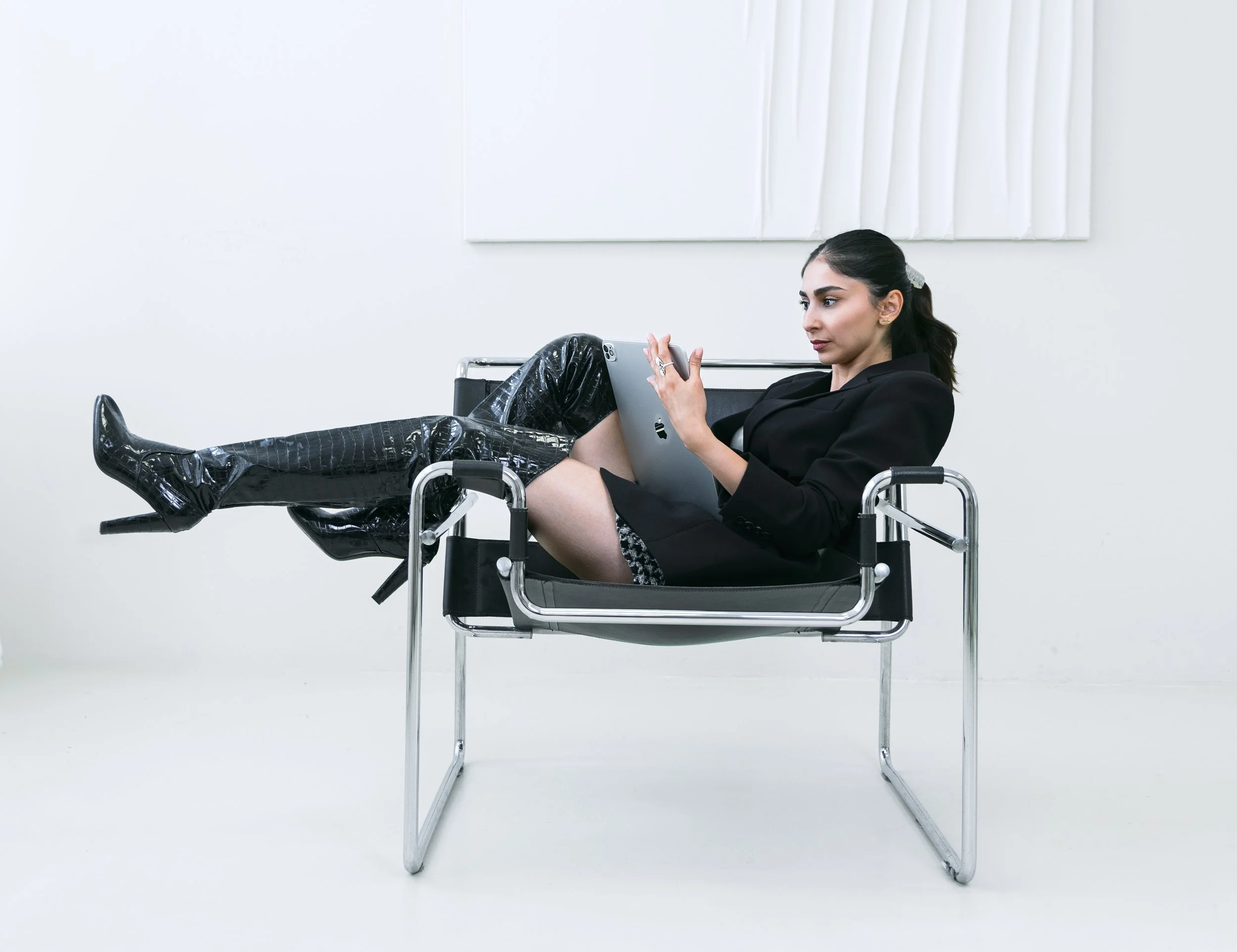
You've done the hard part. Your pricing reflects real expertise and real results. Your offer is clear. Your copy says what it needs to say.
And then, right next to all of that, there’s a photo that doesn’t say the same thing. A phone picture from a couple of years ago. A stock image of a stranger at a laptop. A headshot that was fine when you took it, back when your business was somewhere else.
Most founders never notice this gap, and it’s not because they’re careless. It’s because they fixed the offer and the pricing first, which is exactly the right order. The visuals just never got their turn. Nobody points it out, so it quietly stays.
Here’s the good news: you don’t need a redesign. You need the one piece that’s actually out of sync.
01.
Images are processed faster and more instinctively than words.
Your website isn’t saying what your prices are saying.
When someone lands on your site, or any other visual platforms, they take in your pricing and your photos in the same few seconds. They aren’t reading carefully yet. They’re sensing.
And when those two things disagree, the photos tend to win. Images are processed faster and more instinctively than words. A visitor can read “premium” in your copy and still walk away feeling “not quite,” because what they saw didn’t back it up.
That feeling is hard to name, which is what makes it costly. Nobody emails you to say “your photos made me hesitate.” They just don’t book. The hesitation happens quietly, and it tends to hit hardest with high-ticket clients, who have the most options and the least patience for uncertainty.
The important part: this usually isn’t your whole site. It’s one specific thing.

02.
You Don’t Need a New Website. You Need Strategic Visuals That Do the Selling.
When a site doesn’t feel premium, the instinct is to rebuild it. New template, new structure, new design, new everything. That’s expensive, slow and often not even the real problem.
A redesign changes the container. New strategic visuals change what your dream clients actually see and feel when they look inside it.So this isn’t a design decision. It’s a strategic one.
Ask yourself who you want to attract, and what they need to see in the first few seconds to trust your price. Then let your photos answer that on purpose.
For most founders, that’s the part carrying the weight, and it can move the needle further than a full rebuild for a fraction of the effort. A strategic branding photography is frequently the highest-leverage, lowest-effort fix available. Same layout. Same copy. Same structure but a completely different look and feel.

03.
What “Premium” Actually Looks Like in a Photo
The setting matches the level of your business.
Where you're photographed is part of the message. A cluttered corner, a blank wall, or a random coffee shop tells a different story than an environment that reflects how you actually work and who you serve. The setting doesn't need to be expensive. It needs to be intentional
The images look like they belong together. This is the one most people miss. A homepage photo in warm light, an About page photo in cool light, and a third from a different year with a different filter reads as a grab-bag. Consistency in color, light, and style across the whole site is what makes a brand look established instead of assembled.
The styling supports you instead of competing with you. Wardrobe, hair, and props that fit your brand and don’t pull focus from your face. Everything in the frame should be working for your message.
The expression is real. Stiff, over-posed, or “smile for the camera” faces feel generic, and generic is the opposite of premium. The photos that build trust show you mid-thought, mid-laugh, mid-conversation, like someone clients would want to sit across from.
The edit is clean and natural. Premium doesn’t mean airbrushed or heavily filtered. It means polished while still looking like you.
Here’s the trap worth naming, gently: a real photo of yourself is a good start, and it’s absolutely better than stock photos. But it isn’t automatically premium. A real photo with no intention behind it still reads as unplanned. The difference here isn't “is it actually me.” It is “was this designed to deliver my message?”
That's the shift from having photos to having a visual identity: every image doing a specific job, consistent with your brand voice and the other images, at the level your pricing already claims.

04.
A Two-Minute Test You Can Run Today
Open your website on your phone. Scroll to the place where your pricing or packages appear. Look at the nearest photo, then ask yourself honestly: if I were a stranger seeing this for the first time, would these visuals make me comfortable paying this price?
If the answer is a hesitant “maybe,” you’ve found the gap. And it’s very fixable.

And Finally
Let’ Close the Gap
This is exactly what I do. I help founders whose businesses have outgrown their visuals, and we build a visual identity that finally says what your pricing already says.
It starts with a conversation about your brand, your audience, and the level you’re operating at, and where you are headed. It carries through the shoot and all the way to delivery day.
If you’re ready to see what that could look like for your business, you can explore my services or book a free discovery call with me. We’ll look at where your visuals stand today and map out the simplest way to bring them up to match everything else you’ve built.